
Residential Interior Designer Cambridgeshire & How to Use the best Colour?
How to use The best colour for every room in your home?
How Can an Interior Design Planner in Cambridgeshire Help You?
With the guidance and expertise of our space planning, and access to over 18 years of industry knowledge to help with your interior design home, we offer an unrivalled experience in creating the home of your dreams, so, if you're looking looking for a residential interior designer Cambridgeshire, then look no further than ourselves.
At Pinterior.Space, we never underestimate the importance of colour and the psychology of how different colours affect human mood and behaviour. Colour is a very powerful communication tool and can be used to signal action, influence mood, and even influence physiological reactions. Certain colours have been associated with physiological changes, including increased blood pressure, increased metabolism, and eyestrain.
How do you feel in a yellow room? Does the colour blue make you feel calm and relaxed? We believe that colour can dramatically affect moods, feelings, and emotions.
This is why at Pinterior.space we always consider greatly, each and every individual space in relation to whoever might be living in there, as well as the function of the room. Whether this is designing a Kitchen Interior Design or a Living Room Interior Design or a child's space.
How do you use colour in Residential Interior design?
There is no such thing as a wrong colour, however, if you are not confident how to blend and combine colours in your Interior design for Home space, there are a few things you should consider before introducing them into your home. After all, it's best to explore options on how to pair different shades together, and how much of a particular colour to use in any one room.
Design Solutions for Those Seeking Home Decor Interior Design in Cambridgeshire.
Let's have a look!
1. Using the 60-30-10 rule
This simple rule and allocation of colour "60-30-10" rule, used by all interior designers, and not subject solely to kitchen interior designers in Cambridgeshire, is an Interior design guide that allows you to put a balanced colour scheme together more easily. So, how do we decide?
-60 represents 60% and is the main colour - This is the largest amount of colour ( shade ) that will dominate the room and be the backdrop for your 30% - 30 is where you should use half as much as the 60 hues. This could be introduced in accent chairs, curtains, or a focal point. The remaining 10% will be your accent colour - this could be represented in the form of your furnishings, perhaps showcased on cushions, decorative objects, lamps or artwork.

2. How many colours should you use in one room?
You should only use three colours in any room – although you can successfully incorporate many different tones of these three colours.
This three colour rule will allow you to create a balanced, restful-looking colour scheme that's difficult to go wrong with – particularly if you are creating kitchen interior design, living room Interior design, bedroom interior design and dining room scheme, or, perhaps an open-plan space, that is likely to be busy, and perhaps, more cluttered than other rooms in your home making it a much more difficult space to master.
3. How to select the right colour scheme and colour in your Home Decor Interior Design project?
At Pinterior.space we often lean towards the colour theory. Colour theory is a practical combination of art and science that’s used to determine what colours look good together. The colour wheel is the basis of colour theory because it shows the relationship between colours.
Colours that look good together are called 'colour harmony'. You can use a colour wheel to find colour harmonies by using the rules of colour combinations. Colour combinations determine the relative positions of different colours in order to find colours that create a pleasing effect.

Let's explore some of the most common colour schemes using the Colour wheel!
Monochromatic Colour scheme
The monochromatic Colour scheme uses colours from the same colour family on a colour wheel. This scheme is a one-colour scheme that is created using different tones of that one colour. Once you have chosen your base colour, you can use a colour wheel to help you choose different hues of that same colour, varying the saturation and tone of the base colour to pick out lighter and darker hues. This colour scheme works well for any space in any residential space, however, it's important to consider and contrast the colours by adding materials like wood, metal, glass, mirror, chrome, steel, marble or granite. This will balance the scheme and avoid creating flat spaces, refer to the picture below from our residential interior designer Cambridgeshire.
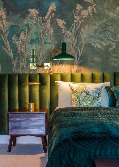
Monochromatic Bedroom
Analogous Colour scheme
Analogous colours are a group of three colours next to each other on a colour wheel, such as violet, red-violet, and red. When these colours are grouped, we call it an analogous colour scheme. If a monochromatic look isn't for you, but you want to build off of one colour you love, go for an analogous color scheme. This colour scheme creates a visually pleasing and calming spaces. For instance, the colour blue can pair nicely with both teal and green. They usually match well and create serene and comfortable designs. Analogous color schemes are often found in nature and are harmonious.

Analogus colour scheme
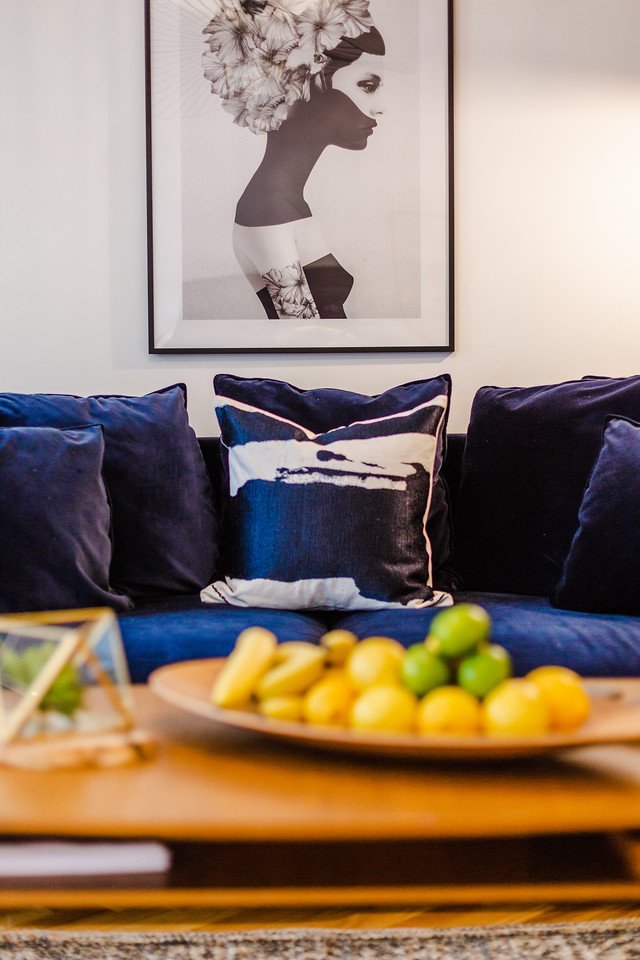
Complimentary Colour scheme
A complementary colour scheme is composed by using two colours opposite each other on the colour wheel. This is the most particularly contrasting of all colour schemes, which attracts the most attention, and one of the primary challenges, when working with it, is to fulfil a harmonious balance. Because this scheme is a combination of warm and cold colour, when it comes to design, you need to carefully examine which of the two colours will be the dominant one. This colour scheme is particularly sharp and can create striking interior spaces.

Complementary colour scheme
Triadic Colour scheme
Three colours that are evenly spaced on the colour wheel. This provides a high contrast colour scheme, but less so than the complementary colour combination — making it more versatile. This combination creates bold, vibrant colour palettes. This colour scheme is one of the most difficult to put together. The best way to achieve the result that you are after is to use one colour as a primary colour and the other colours to use as accents. It is also very effective to have walls with a lighter backdrop, so the colours can pop, and to create the scheme that you desire.

Triadic colour scheme
Using colour theory is the most safe and effective way to allocate the right colour in any Residential Interior home, as well as, other rules that could be implemented to achieve the best outcome. Another way to choose a colour scheme.
4. What are other ways to determine a colour scheme and use the colour wheel as a guide?
Warm or cool colour scheme option!
The temperature of colour affects how it's perceived, and this is where cool and warm colour scheme come into play. Essentially, the basic colour wheel is split into warm and cool tones. The warm half comprises red through yellow-green, and the cool half runs from green through red-violet.
Warm colour scheme
A warm colour scheme can make a large space appear cosier, more intimate, and smaller. If in a room, you want certain elements to feel closer and more drawn in, paint them in warmer colours. The warmest tone on the colour wheel is red, and the last stop on the cool side of the wheel is violet-red.

Warm colour scheme
Cool colour scheme
A cool colour scheme is created from the side of the colour wheel that is comprised of greens, blues, and purples. Cool colours are known to create a calmer and smoother scheme. As opposed to warm tones, the cool ones recede, making a space appear larger. So, if you live in a small apartment, then perhaps, choosing a cooler paint colour might be in your best interest. Colours such as blue, green, and light purple usually signify cool tones.
Another important factor to consider is the effect light has on colour. Lighter or cooler colours reflect more light, than darker, warmer colours. If you want to brighten up a space, choose a lighter, subtler hue that has more white, cream, or beige in it. To tone down a room that gets a lot of light, consider colours that have browns, blacks, or reds in them.
Cool colour scheme
5. Are there any colour rules for a Living room Interior Design?
When it comes to a Living Room Interior Design Cambridge, we don't particularly believe that there are any specific colours that you should be using, or not using. Living rooms are for living, and therefore, we always select the colour palette that makes our clients most comfortable to live in and enjoy. We always consider the space, light, the function of the space, and we ensure that every project also reflects our clients personality, lifestyle and preferences. Our advice would be for any client to Choose the colour palette that makes them feel most comfortable and alive.
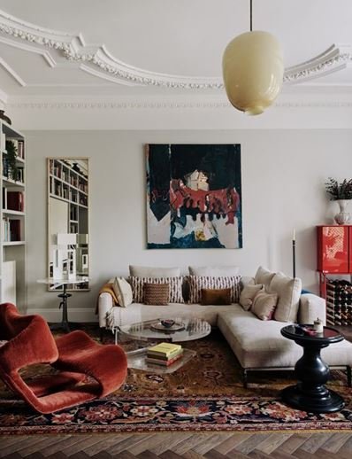
Living room
6. What about the right colour for the Bedroom room interior design?
Choosing the right colour for your bedroom can be a complex exercise in it self-expression. At Pinterior.space, we understand the challenges and importance of colour in any space, particularly in bedrooms. A bedroom is personal sanctuary for rest, relaxation, and intimacy. Whether it's a primary bedroom, guest room, teen's room, or nursery, the wall colour serves as a reminder of what you want to feel in the room. For most people, calm and soothing colours are best in a bedroom. However, you may prefer deep, bright, or saturated colours to help you feel more awake, alert, or romantic. We would always advise that you should choose any colour you love and dial it down from its loudest shade and that might be the perfect colour for you.' Again, we refer to the pictures below our home decor interior design Cambridgeshire at Pinterior.space
Experts agree that blue is the best colour for a bedroom, especially since research shows it can have calming effects.
Green is another relaxing runner-up for its connotations with nature.
In terms of bedroom colours to avoid, overly bright or neon colours can have the opposite effect, making it difficult to fall asleep.


7. What colour rule applies for a Kid's Interior design bedroom?
When it comes to children's spaces, we will probably all agree that Kids are usually high-energy beings who tend to get stimulated by their immediate environment, sounds, and even colours. If you’re decorating a kid's bedroom or a shared bedroom, here at Pinterior.space , we would recommend that you select colours that are more calming and soothing, so that it's easier for children to fall asleep at night or focus on work or play.
These colours could be Pastel yellows, soft blues, aqua greens, and warm pinks, which are good ones to experiment with. You can always add brighter tones on top of these colours to inject a bit more fun as your child grows. A child's bedroom has many functions - children's rooms are for sleeping, dreaming, and rest, but many children play and hang out in their rooms for quiet time alone or with friends. This is why we have to be careful with the selection of the right colours to fulfil these requirements. A child's room should be a similar combination of restoration, and active calm, but, also speak to a child’s sense of self. The child picture below done by our residential Interior designer Cambridgeshire at Pinterior.space

8. Colour rules to consider for a bathroom?
When deciding on the colour scheme in the bathroom , we always need to consider first the actual size of the bathroom ( large, small ), as well as the location of the bathroom, and whomever will be using the bathroom ( family, guest bathroom). These three factors would lead us to a decision on colour scheme. Our experience designers at Pinterior.space always consider making bathrooms as timeless as possible. Bathrooms and kitchens will be the most expensive spaces in the house, therefore, making the right decisions on colour scheme, fixtures, and material, is extremely important. When deciding on the colour scheme in this space, choose a layering of three tones. We would advice to select light tones as the central colour scheme (walls, ceiling), layer another lighter tone (furniture, fixtures), and keep the boldest shades to the minimum (vanity, feature wall). Don't use the same colour more than thrice in this space. picture below by our Interior design for home Cambridgeshire at Pinterior.space

Bathroom
To help us with your design journey, you can reach out today using the contact form or by calling us at 07968 449090. Be sure to explore our portfolio of previous projects to gain a deeper understanding of the exceptional standards we uphold.
Stay connected with us and stay inspired by following our presence on Facebook, Pinterest, and Instagram. We regularly share captivating designs and insights that will fuel your imagination and keep you informed about our latest endeavours.